> ## Documentation Index
> Fetch the complete documentation index at: https://docs.mindset.ai/llms.txt
> Use this file to discover all available pages before exploring further.
# Agent UI color theme
> Using color theme and customizing the agent UI colors
**There are 2 ways to customize the agent UI colors:**
[Using color theme](#using-color-theme)
[Customizing the color values of each color token used in the agent UI](#customizing-the-color-values-of-each-color-token-used-in-the-agent-ui)
# Using color theme
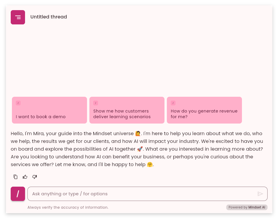
You can apply a harmonious color theme to the agent UI by just altering 3 parameters: `brightness`, `seedColor`, and `dynamicSchemeVariant`.
It allows you to quickly set a color theme for the agent UI without having to customize each color token individually, and match your brand colors.
## Set the theme parameters
In order to apply a color theme to the agent UI, you need to pass a `theme` parameter to the `mindset.init()` method:
```javascript theme={null}
const lightTheme = {
brightness: 'light',
seedColor: '#8E004E',
dynamicSchemeVariant:'fidelity'
}
mindset.init({
fetchAuthentication: getAuthToken,
appUid: "YOUR-APP-UID",
theme: lightTheme
})
```
## Adjust your theme palette
With only 3 key parameters, you can generate harmonious color palettes.
The `theme` object looks like this:
```javascript theme={null}
const Theme = {
brightness: 'light',
seedColor: '#8E004E',
dynamicSchemeVariant:'fidelity'
}
```
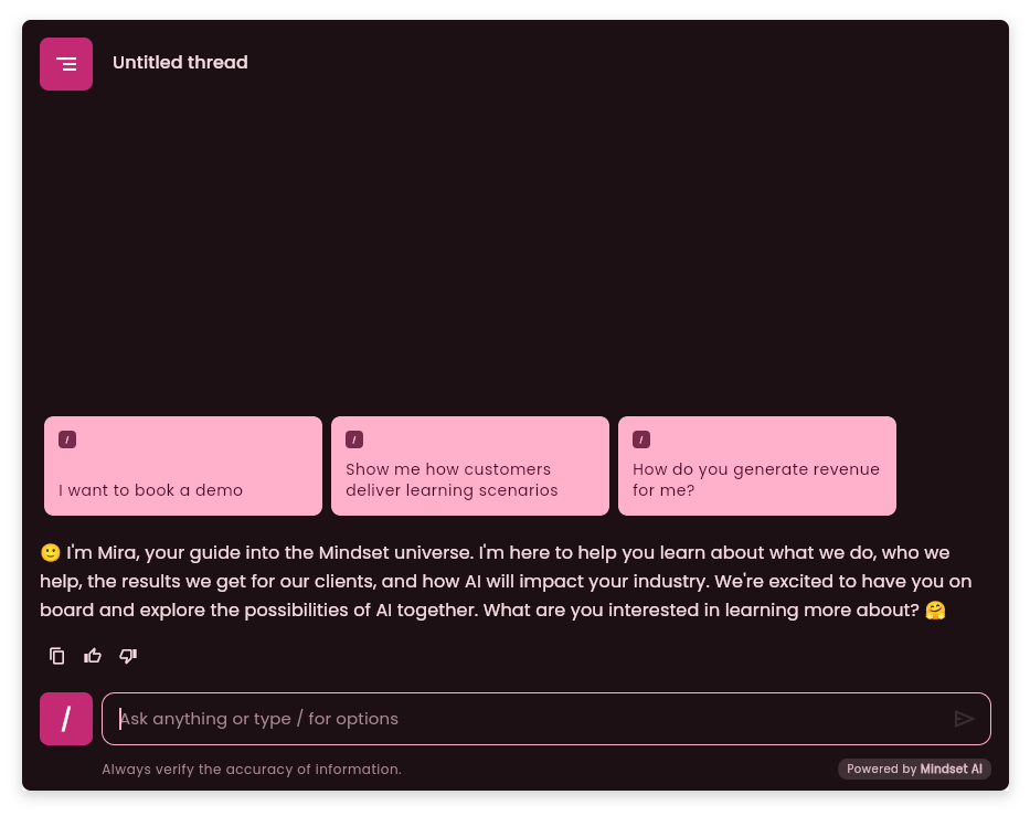
The `brightness` parameter can be either `"light"` or `"dark"`. It is used to set the overall brightness of the theme.
The `seedColor` parameter is the main color of the theme, and it is used to generate the other colors of the palette.
The `dynamicSchemeVariant` parameter is used to influence the color generation algorithm, see the [Play with the dynamicSchemeVariant option](#play-with-the-dynamicschemevariant-option) section below for more details.
## Examples of theme palette using only `seedColor`
 ## Play with the dynamicSchemeVariant option
The core purpose of `dynamicSchemeVariant` is to allow you to select a specific aesthetic interpretation or "flavor" of the automatically generated color scheme.
The `dynamicSchemeVariant` can take one of the following values:
| Value | Description |
| :------------- | :--------------------------------------------------------------------------------------------------------------------------------------------------------------------------------------------------------------------- |
| **tonalSpot** | Default for Material theme colors. Builds pastel palettes with a low chroma. |
| **fidelity** | The resulting color palettes match seed color, even if the seed color is very bright (high chroma). |
| **monochrome** | All colors are grayscale, no chroma. |
| **neutral** | Close to grayscale, a hint of chroma. |
| **expressive** | Pastel colors, medium chroma palettes. The primary palette's hue is different from the seed color, for variety. |
| **content** | Almost identical to fidelity. Tokens and palettes match the seed color. ColorScheme.primaryContainer is the seed color, adjusted to ensure contrast with surfaces. The tertiary palette is analogue of the seed color. |
| **rainbow** | A playful theme where the seed color's hue does not appear in the theme's generated colors. It aims for a broader spectrum of hues. |
| **fruitSalad** | Another playful theme, similar to `rainbow`, where the seed color's hue also typically does not appear in the generated theme. |
# Customizing the color values of each color token used in the agent UI
To achieve the best and most predictable results, you can precisely configure the color of each token in your palette. (See the [All available color tokens](#all-available-color-tokens) section ).
You can also choose to specify only key colors such as `primary`, `secondary` and `surface` and the rest of the colour palette will be generated using the `dynamicSchemeVariant` and the generation algorithm.
```javascript theme={null}
const Theme = {
brightness: 'light',
seedColor: '#8E004E',
primary: "#8F4C38",
secondary: "#77574E",
surface: "#FFFFFF",
dynamicSchemeVariant:'fidelity'
}
```
## The `surface` token
When generating the color palette, the agent background color will be set with a tint.
Many web pages use the `white` color as the background, in which case you can set the `surface` token to `white` to ensure the agent UI blends seamlessly with the page background.
You can of course set the `surface` token to any color you want.
```javascript theme={null}
const Theme = {
brightness: 'light',
seedColor: '#8E004E',
surface: "#FFFFFF",
dynamicSchemeVariant:'fidelity'
}
```
## All available color tokens
When configuring individually all tokens, the final `theme` object which is passed to the `mindset.init()` method looks like this:
To understand where each token is used in the agent system : [Detailed breakdown of the color tokens](#detailed-breakdown-of-the-color-tokens)
```javascript theme={null}
const Theme = {
brightness: "light",
primary: "#8F4C38",
surfaceTint: "#8F4C38",
onPrimary: "#FFFFFF",
primaryContainer: "#FFDBD1",
onPrimaryContainer: "#723523",
secondary: "#77574E",
onSecondary: "#FFFFFF",
secondaryContainer: "#FFDBD1",
onSecondaryContainer: "#5D4037",
tertiary: "#6C5D2F",
onTertiary: "#FFFFFF",
tertiaryContainer: "#F5E1A7",
onTertiaryContainer: "#534619",
error: "#BA1A1A",
onError: "#FFFFFF",
errorContainer: "#FFDAD6",
onErrorContainer: "#93000A",
background: "#FFF8F6",
onBackground: "#231917",
surface: "#FFF8F6",
onSurface: "#231917",
surfaceVariant: "#F5DED8",
onSurfaceVariant: "#53433F",
outline: "#85736E",
outlineVariant: "#D8C2BC",
shadow: "#000000",
scrim: "#000000",
inverseSurface: "#392E2B",
inverseOnSurface: "#FFEDE8",
inversePrimary: "#FFB5A0",
primaryFixed: "#FFDBD1",
onPrimaryFixed: "#3A0B01",
primaryFixedDim: "#FFB5A0",
onPrimaryFixedVariant: "#723523",
secondaryFixed: "#FFDBD1",
onSecondaryFixed: "#2C150F",
secondaryFixedDim: "#E7BDB2",
onSecondaryFixedVariant: "#5D4037",
tertiaryFixed: "#F5E1A7",
onTertiaryFixed: "#231B00",
tertiaryFixedDim: "#D8C58D",
onTertiaryFixedVariant: "#534619",
surfaceDim: "#E8D6D2",
surfaceBright: "#FFF8F6",
surfaceContainerLowest: "#FFFFFF",
surfaceContainerLow: "#FFF1ED",
surfaceContainer: "#FCEAE5",
surfaceContainerHigh: "#F7E4E0",
surfaceContainerHighest: "#F1DFDA"
}
```
There are available visual tools that can help you to generate a harmonious palette of colour values for each token.
## Tools you can use to generate a color palette
To ensure your agent's UI effectively matches your brand, we recommend using [Google's Material 3 theme builder](https://material-foundation.github.io/material-theme-builder/) to generate a usable color palette. This web-based tool is easily accessible to developers and designers, and provides a robust starting point.
For those working in Figma, the [Material Theme Builder](https://www.figma.com/community/plugin/1034969338659738588/material-theme-builder) plugin for Figma offers the added flexibility to make further manual adjustments to each color in the generated palette. This allows for fine-tuning to perfectly align with your brand's aesthetic.
By leveraging these tools, you can create a consistent and brand-aligned visual experience across your agent's user interface, enabling your customers to easily recognize and connect with your brand.
## Google's Material 3 theme builder
## Play with the dynamicSchemeVariant option
The core purpose of `dynamicSchemeVariant` is to allow you to select a specific aesthetic interpretation or "flavor" of the automatically generated color scheme.
The `dynamicSchemeVariant` can take one of the following values:
| Value | Description |
| :------------- | :--------------------------------------------------------------------------------------------------------------------------------------------------------------------------------------------------------------------- |
| **tonalSpot** | Default for Material theme colors. Builds pastel palettes with a low chroma. |
| **fidelity** | The resulting color palettes match seed color, even if the seed color is very bright (high chroma). |
| **monochrome** | All colors are grayscale, no chroma. |
| **neutral** | Close to grayscale, a hint of chroma. |
| **expressive** | Pastel colors, medium chroma palettes. The primary palette's hue is different from the seed color, for variety. |
| **content** | Almost identical to fidelity. Tokens and palettes match the seed color. ColorScheme.primaryContainer is the seed color, adjusted to ensure contrast with surfaces. The tertiary palette is analogue of the seed color. |
| **rainbow** | A playful theme where the seed color's hue does not appear in the theme's generated colors. It aims for a broader spectrum of hues. |
| **fruitSalad** | Another playful theme, similar to `rainbow`, where the seed color's hue also typically does not appear in the generated theme. |
# Customizing the color values of each color token used in the agent UI
To achieve the best and most predictable results, you can precisely configure the color of each token in your palette. (See the [All available color tokens](#all-available-color-tokens) section ).
You can also choose to specify only key colors such as `primary`, `secondary` and `surface` and the rest of the colour palette will be generated using the `dynamicSchemeVariant` and the generation algorithm.
```javascript theme={null}
const Theme = {
brightness: 'light',
seedColor: '#8E004E',
primary: "#8F4C38",
secondary: "#77574E",
surface: "#FFFFFF",
dynamicSchemeVariant:'fidelity'
}
```
## The `surface` token
When generating the color palette, the agent background color will be set with a tint.
Many web pages use the `white` color as the background, in which case you can set the `surface` token to `white` to ensure the agent UI blends seamlessly with the page background.
You can of course set the `surface` token to any color you want.
```javascript theme={null}
const Theme = {
brightness: 'light',
seedColor: '#8E004E',
surface: "#FFFFFF",
dynamicSchemeVariant:'fidelity'
}
```
## All available color tokens
When configuring individually all tokens, the final `theme` object which is passed to the `mindset.init()` method looks like this:
To understand where each token is used in the agent system : [Detailed breakdown of the color tokens](#detailed-breakdown-of-the-color-tokens)
```javascript theme={null}
const Theme = {
brightness: "light",
primary: "#8F4C38",
surfaceTint: "#8F4C38",
onPrimary: "#FFFFFF",
primaryContainer: "#FFDBD1",
onPrimaryContainer: "#723523",
secondary: "#77574E",
onSecondary: "#FFFFFF",
secondaryContainer: "#FFDBD1",
onSecondaryContainer: "#5D4037",
tertiary: "#6C5D2F",
onTertiary: "#FFFFFF",
tertiaryContainer: "#F5E1A7",
onTertiaryContainer: "#534619",
error: "#BA1A1A",
onError: "#FFFFFF",
errorContainer: "#FFDAD6",
onErrorContainer: "#93000A",
background: "#FFF8F6",
onBackground: "#231917",
surface: "#FFF8F6",
onSurface: "#231917",
surfaceVariant: "#F5DED8",
onSurfaceVariant: "#53433F",
outline: "#85736E",
outlineVariant: "#D8C2BC",
shadow: "#000000",
scrim: "#000000",
inverseSurface: "#392E2B",
inverseOnSurface: "#FFEDE8",
inversePrimary: "#FFB5A0",
primaryFixed: "#FFDBD1",
onPrimaryFixed: "#3A0B01",
primaryFixedDim: "#FFB5A0",
onPrimaryFixedVariant: "#723523",
secondaryFixed: "#FFDBD1",
onSecondaryFixed: "#2C150F",
secondaryFixedDim: "#E7BDB2",
onSecondaryFixedVariant: "#5D4037",
tertiaryFixed: "#F5E1A7",
onTertiaryFixed: "#231B00",
tertiaryFixedDim: "#D8C58D",
onTertiaryFixedVariant: "#534619",
surfaceDim: "#E8D6D2",
surfaceBright: "#FFF8F6",
surfaceContainerLowest: "#FFFFFF",
surfaceContainerLow: "#FFF1ED",
surfaceContainer: "#FCEAE5",
surfaceContainerHigh: "#F7E4E0",
surfaceContainerHighest: "#F1DFDA"
}
```
There are available visual tools that can help you to generate a harmonious palette of colour values for each token.
## Tools you can use to generate a color palette
To ensure your agent's UI effectively matches your brand, we recommend using [Google's Material 3 theme builder](https://material-foundation.github.io/material-theme-builder/) to generate a usable color palette. This web-based tool is easily accessible to developers and designers, and provides a robust starting point.
For those working in Figma, the [Material Theme Builder](https://www.figma.com/community/plugin/1034969338659738588/material-theme-builder) plugin for Figma offers the added flexibility to make further manual adjustments to each color in the generated palette. This allows for fine-tuning to perfectly align with your brand's aesthetic.
By leveraging these tools, you can create a consistent and brand-aligned visual experience across your agent's user interface, enabling your customers to easily recognize and connect with your brand.
## Google's Material 3 theme builder
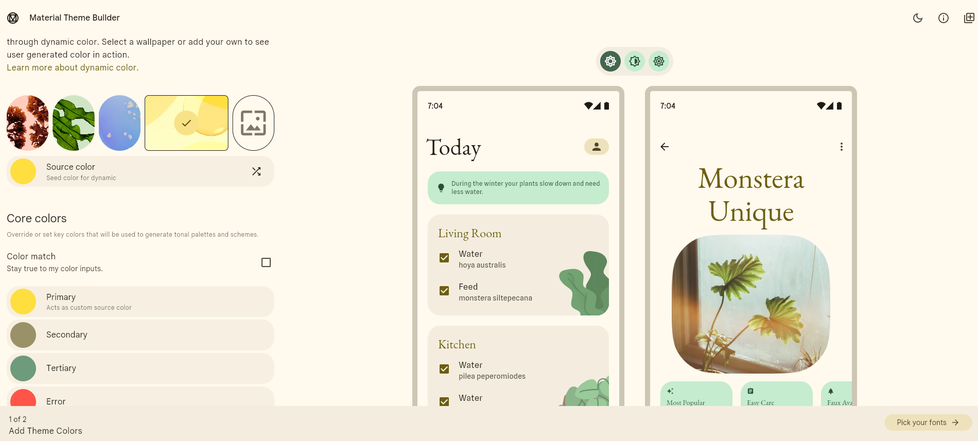 Choose the core colors of your theme.
Export the theme as the Material Theme (JSON) format
Copy the `light` and `dark` theme objects from the `material-theme.json` file.
You can use any LLM to convert the JSON object to a Javascript object.
From :
```javascript theme={null}
const Theme = {
"primary": "#8F4C38",
"surfaceTint": "#8F4C38",
"onPrimary": "#FFFFFF",
....
```
To :
```javascript theme={null}
const Theme = {
primary: "#8F4C38",
surfaceTint: "#8F4C38",
onPrimary: "#FFFFFF",
....
```
Paste the final theme object in your code, and pass it to the `mindset.init()` method.
## Detailed breakdown of the color tokens
Indicates whether the theme is "**light**" or "**dark**". This influences how colors are used and perceived.
All the values below will overwrite the defaults created for light and dark if they are hard set - for example, `surface` is set to black in dark mode and white in light mode, but if a specific surface color is used then this will be used regardless of what dark and light determine.
Specifies the algorithm used to generate the color scheme from the `seedColor`.
Check the [Play with the dynamicSchemeVariant option](#play-with-the-dynamicschemevariant-option) section above for more details.
The `seedColor` parameter is the main color of the theme, and it is used to generate the other colors of the palette.
The main color used throughout the UI, often for key interactive elements.
This is used for the main agent text bubble, and other primary buttons like the thread list and capability chooser.
The background color of most of the app's UI.
A color overlay applied to surfaces to indicate elevation.
The color used for text and icons displayed on top of the `primary` color.
A slightly lighter or darker variant of the `primary` color used for container backgrounds.
The color used for text and icons displayed on top of the `primaryContainer` color.
A color used to provide visual balance and distinguish elements from the primary ones.
The color used for text and icons displayed on top of the `secondary` color.
A variant of the `secondary` color used for container backgrounds.
The color used for text and icons displayed on top of the `secondaryContainer` color.
An optional color used to provide more visual variety and accent elements.
The color used for text and icons displayed on top of the `tertiary` color.
A variant of the `tertiary` color used for container backgrounds.
The color used for text and icons displayed on top of the `tertiaryContainer` color.
The color used for error messages and warnings.
The color used for text and icons displayed on top of the `error` color.
A variant of the `error` color used for error message containers.
The color used for text and icons displayed on top of the `errorContainer` color.
The color used for text and icons displayed on top of the `surface` color.
A slightly different variant of the `surface` color.
The highest elevation surface container color.
A variant of the `outline` color.
The color used for shadows.
The color used for scrims (semi-transparent overlays).
An alternate surface color, often used in specific UI sections.
The color used for text and icons displayed on top of the `inverseSurface` color.
An alternate primary color, typically used with the `inverseSurface`.
Fixed color roles used in components like navigation bars or tabs that maintain their color even when scrolling.
Various surface container colors with different elevation and brightness levels.
Choose the core colors of your theme.
Export the theme as the Material Theme (JSON) format
Copy the `light` and `dark` theme objects from the `material-theme.json` file.
You can use any LLM to convert the JSON object to a Javascript object.
From :
```javascript theme={null}
const Theme = {
"primary": "#8F4C38",
"surfaceTint": "#8F4C38",
"onPrimary": "#FFFFFF",
....
```
To :
```javascript theme={null}
const Theme = {
primary: "#8F4C38",
surfaceTint: "#8F4C38",
onPrimary: "#FFFFFF",
....
```
Paste the final theme object in your code, and pass it to the `mindset.init()` method.
## Detailed breakdown of the color tokens
Indicates whether the theme is "**light**" or "**dark**". This influences how colors are used and perceived.
All the values below will overwrite the defaults created for light and dark if they are hard set - for example, `surface` is set to black in dark mode and white in light mode, but if a specific surface color is used then this will be used regardless of what dark and light determine.
Specifies the algorithm used to generate the color scheme from the `seedColor`.
Check the [Play with the dynamicSchemeVariant option](#play-with-the-dynamicschemevariant-option) section above for more details.
The `seedColor` parameter is the main color of the theme, and it is used to generate the other colors of the palette.
The main color used throughout the UI, often for key interactive elements.
This is used for the main agent text bubble, and other primary buttons like the thread list and capability chooser.
The background color of most of the app's UI.
A color overlay applied to surfaces to indicate elevation.
The color used for text and icons displayed on top of the `primary` color.
A slightly lighter or darker variant of the `primary` color used for container backgrounds.
The color used for text and icons displayed on top of the `primaryContainer` color.
A color used to provide visual balance and distinguish elements from the primary ones.
The color used for text and icons displayed on top of the `secondary` color.
A variant of the `secondary` color used for container backgrounds.
The color used for text and icons displayed on top of the `secondaryContainer` color.
An optional color used to provide more visual variety and accent elements.
The color used for text and icons displayed on top of the `tertiary` color.
A variant of the `tertiary` color used for container backgrounds.
The color used for text and icons displayed on top of the `tertiaryContainer` color.
The color used for error messages and warnings.
The color used for text and icons displayed on top of the `error` color.
A variant of the `error` color used for error message containers.
The color used for text and icons displayed on top of the `errorContainer` color.
The color used for text and icons displayed on top of the `surface` color.
A slightly different variant of the `surface` color.
The highest elevation surface container color.
A variant of the `outline` color.
The color used for shadows.
The color used for scrims (semi-transparent overlays).
An alternate surface color, often used in specific UI sections.
The color used for text and icons displayed on top of the `inverseSurface` color.
An alternate primary color, typically used with the `inverseSurface`.
Fixed color roles used in components like navigation bars or tabs that maintain their color even when scrolling.
Various surface container colors with different elevation and brightness levels.